

7 November 2026
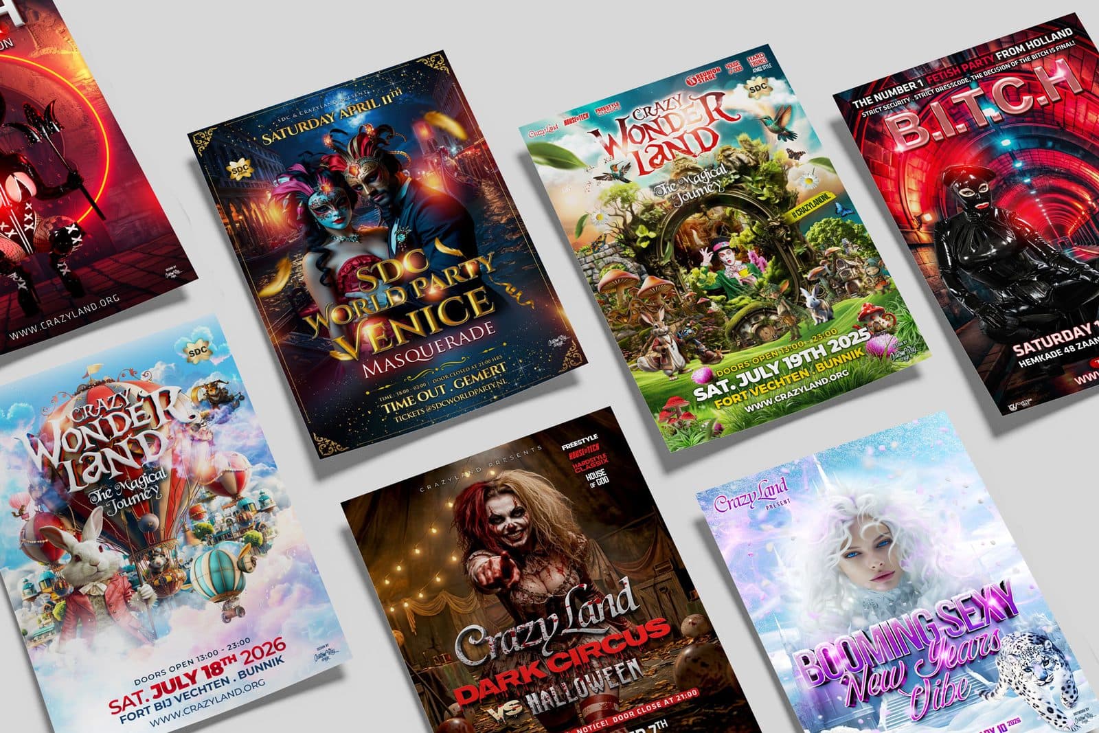
Getting a flyer designed for your event
A flyer that gets left behind or goes straight in the bin? Here's how to design one that actually works, from first impression to print-ready delivery.
What a flyer really needs to do
Before you start thinking about colours and typefaces: decide what your flyer needs to achieve. Do you want someone to remember a date, to scan the QR code for tickets, or to take the flyer away and put it up? That question determines almost every design choice. Most flyers try to say everything at once and end up as a crammed leaflet that nobody looks at.
When getting a flyer designed for a festival or party, one clear message works best. That means: the name of your event large and recognisable, date and location immediately visible, and one clear action such as 'tickets via the website'. Everything that comes after — DJs, timetable, sponsors — is secondary and can be smaller or on the back. Anyone who understands what, where and when in three seconds will pick up the flyer. Anyone who has to search will walk on.
For events, also think about the context in which your flyer lives. A flyer on a pub noticeboard competes with dozens of others. A flyer handed out on the street has even less time. An A6 in someone's hand is different from an A5 on the counter. Match the format and visual busyness to that spot, not to what looks good in your own design file.
Design choices that make the difference
Work with a clear hierarchy. One large image or one strong typographic statement draws attention; the rest supports it. If you choose a photo, make sure it remains legible at a small size too: busy group photos with lots of faces lose their impact as soon as they're pocket-sized. A high-contrast image with room for text often works better than a full composition onto which you have to squeeze text.
Colour use is a pitfall. Bright colours stand out, but on cheaper paper or with printing that has a smaller colour gamut, your carefully chosen neon can suddenly turn out flat. Ask your printer about the colour profile and supply your files in that profile, with bleed and at sufficient resolution. Nothing is as frustrating as a flyer that glows on your screen and comes off the press as a grey version of itself.
Don't forget the back. It's not leftover space but a second chance: programme, line-up, a short atmospheric text or a sponsor block. Use the back to provide the information the front deliberately left out, in the same visual style. That way the flyer as a whole remains coherent and recognisable, even if someone finds it again in a bag later.
What doesn't work (and why)
Too much text is the most common mistake. A flyer is not a press release; it needs to capture a moment and make people curious. Three blocks of text full of explanation about the concept won't be read, however well written. Summarise, leave out, and refer to your website or socials for the details.
Too many different typefaces and colours also kills recognisability. Two typefaces and one or two accent colours are usually enough. And be careful with busy backgrounds behind text: what still looks legible on your screen quickly becomes an unreadable mush on paper or in bright light. So test your design at actual size and look at it from a distance — literally.
Finally: a flyer without a clear call-to-action is a missed opportunity. No QR code, no website, no 'buy your ticket now'? Then the recipient knows something is happening, but not what they should do. Always make the next step visible and easy, even if someone only comes across the flyer days later.
From design to print and distribution
A strong design stands or falls by good file delivery. Supply in the correct format, with trim margin, in CMYK and at a resolution that stays sharp. Ask your printer for a proof on larger print runs, especially with dark or colourful designs. The difference between screen and paper is bigger than you think, and a proof prevents you from printing thousands of flyers that are just not quite right.
Also think about material. For outdoor advertising or flyers that need to stay put for a long time, somewhat heavier or water-resistant paper is worth the investment. For a mass handout at a festival site, simpler paper is fine. Match the weight and finish to how the flyer will be used, not to habit.
And then distribution: think in advance about where your flyers will be and who will pick them up. A stack in a café reaches a different audience than flyers you hand out personally or leave at an afterparty. So don't just make your flyer beautiful, but also make sure it ends up in the right place. The design is half the work; the other half is making sure it gets seen.
Want to know more?
Curious what Custom Way Design can do for you in the field of flyer design?
View Flyer designGet in touch
Want to discuss an assignment or project? Tell us what you are working on — we reply within two working days.
Get in touch