
6 November 2026
Designing fence banners: tips & formats
Fence banners stand out where your event begins. Here's how to choose the right format, material and design that works.
Why a fence banner is your first impression
A visitor often sees your fence banner from a distance. It's one of the first things that catches the eye on arrival, even before anyone has scanned a ticket or looked at a programme. Yet this banner is often treated as an afterthought, while it's one of the most effective and affordable ways to present your event professionally. With a well-designed fence banner you immediately set the mood, give direction and reinforce your brand.
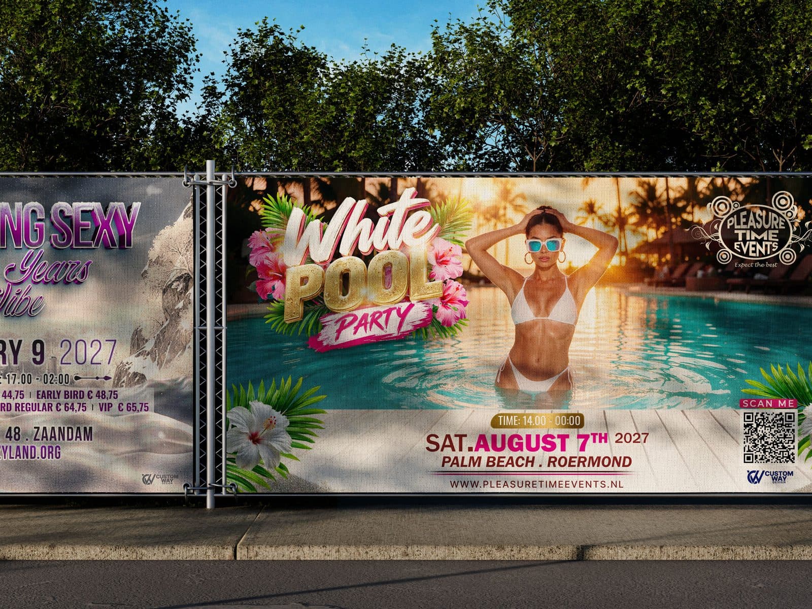
Designing a fence banner isn't about cramming as much information as possible onto one banner. It's about contrast, legibility from a distance and a design that fits the rest of your event. In practice I often see organisations forget that a banner hangs at eye level and is therefore viewed very differently from a flyer or poster. Think of a guest walking past from five metres away: what should they see? Usually that's the name of your event, a short, punchy message and possibly a reference to the location or entrance.
Formats and materials: what works in practice
Fence banners come in various standard sizes, but the most commonly used formats are construction fencing 338 x 174 cm and crowd barrier format 215 x 73 cm. If you're choosing a smaller fence or want a wide banner across several panels, there are also options such as 100 x 100 cm or very wide versions. It's important to take into account the distance to the visitor and the height of the fencing. If you hang a banner low, a landscape format is often more legible. If you hang it high, a square or portrait format sometimes works better.
In terms of material there are two common choices: classic canvas (often 510-gram PVC) and fine-mesh gauze fabric. The advantage of gauze fabric is that it lets the wind through, so your banner is less likely to flap or tear in strong winds. That's especially useful at outdoor festivals or locations where it can get quite windy. Canvas is a little cheaper and somewhat heavier, which is handy if you want to stretch it taut. If you go for gauze, bear in mind a slightly lower colour intensity: fine designs with lots of detail come across less sharply on gauze than on canvas.
Design tips for a fence banner that sticks
Designing a fence banner isn't a matter of enlarging an existing poster. The proportions are different, the reading distance is different and the context is different. Start with a clear hierarchy: put the event name or brand large, followed by one core message or call to action. Avoid small print and too many blocks of text. A banner is not a brochure; you literally have three seconds to make an impact.
Use high-contrast colours that tie in with your event or brand identity, but do check them for legibility from a few metres away. A dark background with white or bright letters often works well, as does a striking accent colour for the most important information. Also make sure there's enough margin around the edges, so the banner doesn't look 'full' and nothing gets lost behind fencing or fixings when it's mounted. Finally: think about where the banner will hang. Will there be a fence or post in front of it? Then it's better to place important elements slightly higher or more centrally.
Want to know more?
Curious what Custom Way Design can do for you in the field of lp.hekwerkbanners?
View lp.hekwerkbannersGet in touch
Want to discuss an assignment or project? Tell us what you are working on — we reply within two working days.
Get in touch