8 August 2026
A modular design system for your site
A modular design system keeps your website consistent, scalable and fast. Discover how to set one up and why it strengthens your brand.
Why separate pages make your website fragile
Many websites grow organically: a landing page here, a new section there. Every page is designed and built separately, often by different people or at different times. The result is that buttons have slightly different colours, headings jump around and the look differs from page to page. Visitors unconsciously notice this as messy or unprofessional.
What's more, maintenance takes up a disproportionate amount of time. A small change to the brand identity means manually updating dozens of pages. A modular design system breaks that pattern by putting reuse centre stage. You define fixed building blocks that recur everywhere, from the homepage to an event page. That makes your website not only more consistent, but also a good deal more agile.
What a modular design system actually is
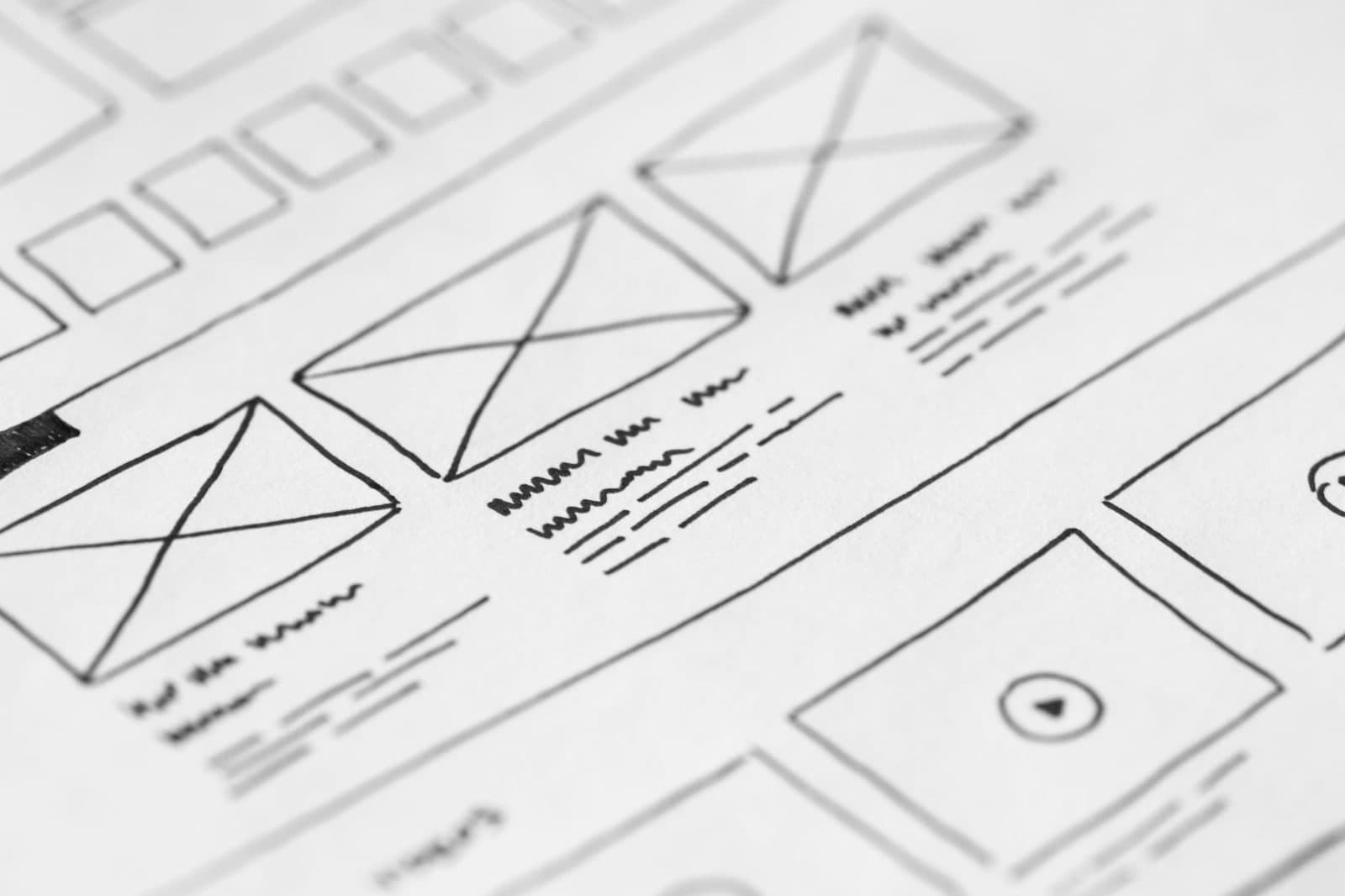
A modular design system is a collection of agreements and components that together form the visual and functional basis of your website. Think of a limited set of colours, typography, white space, buttons, forms and cards. Each component has a clear role and fixed properties. This creates a kind of toolbox with which you can vary endlessly without losing unity.
The beauty of it is that it speeds up both design and development. You don't build a new page from scratch, but assemble it from existing blocks. Want to promote a new event? Then you combine a hero block, a text block with an image and a call-to-action. All the styles are already determined, so all you have to do is fill in the content. That saves hours of work and prevents discussion about pixel deviations.
From theory to practice: this is how you build one
Start small. Choose the five to eight most-used UI elements on your site, such as headings, paragraphs, buttons, links, forms and images with captions. Record the exact properties for each element: which colour, which typeface, which spacing. Document this in a central place, for example in an online style guide that both designers and developers can consult.
Then translate that style guide into code. In modern front-end frameworks such as React or Vue, you build reusable components that share exactly the same styling and logic. In a CMS such as WordPress or Sanity, you create blocks that content managers can drag and drop, without breaking the design. Test the system with a few real pages before you overhaul everything. And keep it alive: add new components when needed, but only adjust existing ones if it genuinely makes them better.
Why this benefits your brand and your budget
A modular design system is not a technical frivolity, but a strategic choice. It ensures a recognisable brand experience on every page, because the visual language is the same everywhere. Visitors trust a consistent website more quickly and navigate more easily. That translates directly into more conversion and a stronger sense of professionalism.
On top of that, you save on costs structurally. New pages or campaigns can be launched quickly without having to design them again. Your team spends less time on internal alignment and fixing inconsistencies. And when you eventually want to expand with a webshop, event portal or customer portal, you build on the same foundation. That way your website grows along with your ambitions, instead of you having to reinvent everything every few years.
Want to know more?
Curious what Custom Way Design can do for you in the field of web design & web development?
View Web design & web developmentGet in touch
Want to discuss an assignment or project? Tell us what you are working on — we reply within two working days.
Get in touch