

13 September 2026
Your event website: often the weakest link
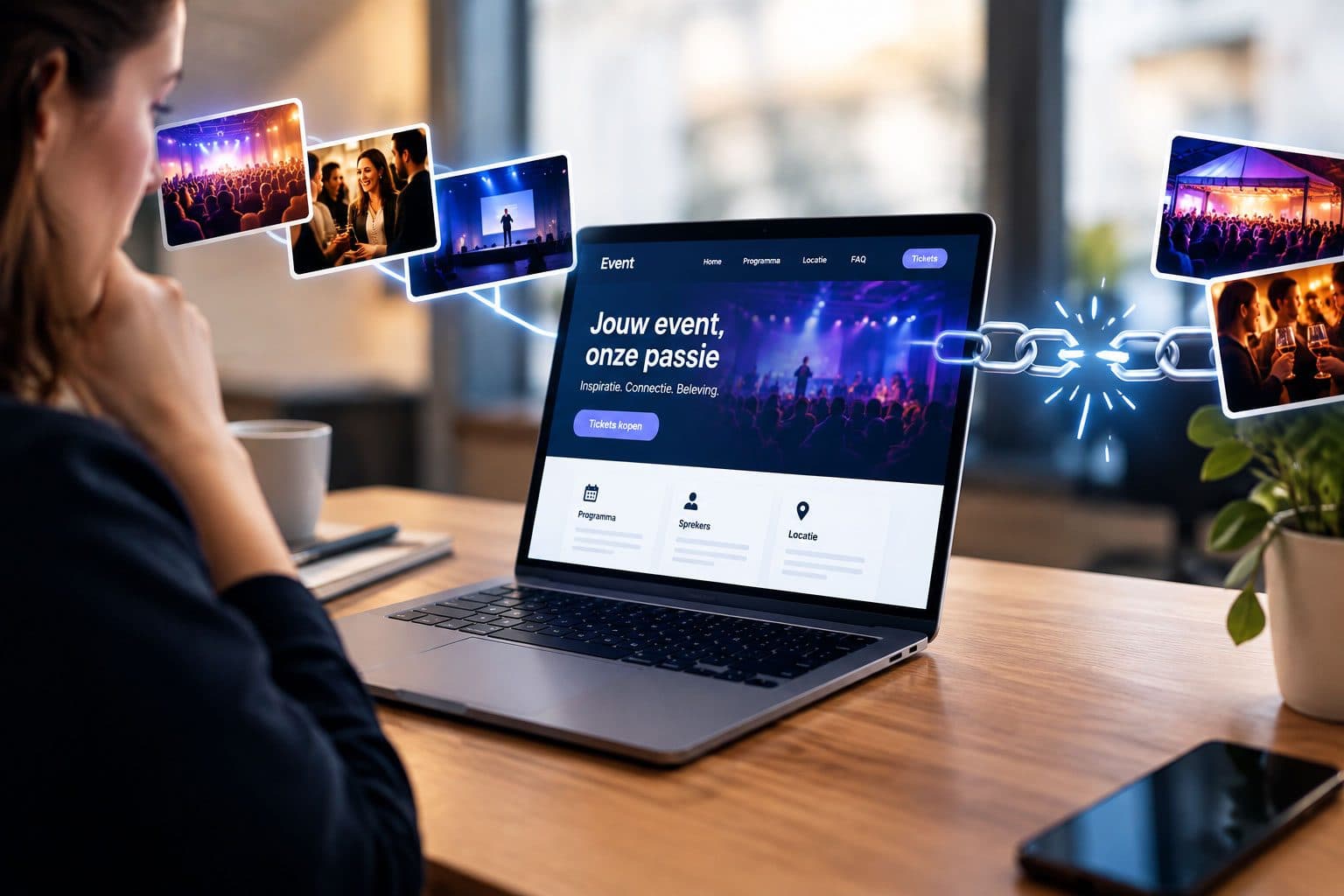
Your event is choreographed down to the last detail, but your website feels like a box-ticking exercise. Here's how to make your event page the starting point of the experience.
The first impression doesn't start at the door, but at your event page
Most organisers spend weeks on production: lighting, sound, room layout, catering, the perfect opening speech. Understandably so. But by far the majority of visitors don't form their first impression in the room — they form it on your event page, often on a phone, in thirty seconds. What they see there determines whether they sign up, whether they hesitate, or whether they forward the link to a colleague.
Yet the event website is usually the last thing to be put together, with a standard template and a registration form on top. The result is a strange disconnect: the experience in the room is considered and personal, but the online stage feels generic and flat. Visitors notice that difference, even if they don't name it. They drop off when in doubt, or they arrive with the wrong expectation.
The core question isn't whether your website looks good, but whether it evokes the same feeling as the event itself. That means: the same tone, the same tension or warmth, the same pace. An event centred on connection calls for a different online route than an event centred on knowledge or a grand reveal.
Think in terms of a route, not a standalone page
When it comes to event concepts, we like to talk about a common thread: how does someone come in, what happens next, where does the highlight emerge, how does it resonate afterwards. That same logic works online, and that's precisely where things often go wrong. An event website is usually one long page with a date, a location and a button, where the visitor has no idea what to expect.
So build your event page as a route with moments. What do you want someone to feel when they open it? Curiosity, for example: a short cinematic atmosphere impression, a striking headline that sums up the promise of the day. Then you want trust: who is speaking, which names are behind it, what audience will you meet. And only then do you want action: a registration that feels like a logical next step, not a sales wall.
That structure calls for choices, not more text. One clear image that captures the mood works better than ten stock photos of people with a tablet. One sentence about the feeling of the day does more than three paragraphs about the organisation. And the form itself is part of the experience: how short, how friendly, how logically laid out is it? If this is your only conversion point, it deserves more attention than the footer.
A practical exercise: have someone who knows nothing about the event look at your event page and tell you within ten seconds what it's about, who it's for and what the next step is. If that doesn't work, there's work to be done — and that work often pays off more than another social post.
Technology that supports the experience instead of working against it
The biggest frustration on event pages is almost always the same: a registration form that loads slowly, is difficult to fill in on mobile, or wipes your input after an error message. These aren't details; that's the difference between a smooth start and a first negative association with your event. Visitors forgive a sparse atmosphere photo more easily than a form that glitches.
So think about what needs to happen technically before you build something beautiful. Loading speed over animation, clear fields and labels, a confirmation that immediately reassures, and a calendar item or confirmation email that gets someone in the mood straight away. Small choices help too: a countdown clock that creates urgency without being shouty, interactive maps for multiple sessions or time slots, and directions that aren't hidden at the bottom.
And not unimportant: if your event has a physical location, translate it to the screen. Atmosphere shots from previous editions, a short video clip of the entrance, or a small detail like the scent or the sound of the evening in words. You don't need a big budget to do that, but you do need the willingness to treat your event as a place online too, not as an administrative obligation.
Measure what works, without losing the atmosphere
The beauty of an event page is that you can see fairly precisely where things go wrong. Where do visitors drop off: at the price, at the speaker descriptions, at the form? Go through your heatmaps and session recordings, or simply ask the people who signed up last time. You often get answers you hadn't thought of yourself: too unclear what you get, doubt about the level, no idea whether there's room for questions.
Use those insights to improve your route, not to cram your page full. One well-placed quote from a participant, a small overview of what a day concretely delivers, or a clear FAQ that removes doubts. That's not a marketing trick, that's hospitality online.
By treating every event as a brand experience — from the first click to the follow-up email — you extend the impact. The people who spread the word about your event the most are the ones who felt understood from start to finish. That begins on a small screen, at the moment someone curiously taps your link.
Want to know more?
Curious what Custom Way Design can do for you in the field of event concept development?
View Event concept developmentGet in touch
Want to discuss an assignment or project? Tell us what you are working on — we reply within two working days.
Get in touch